

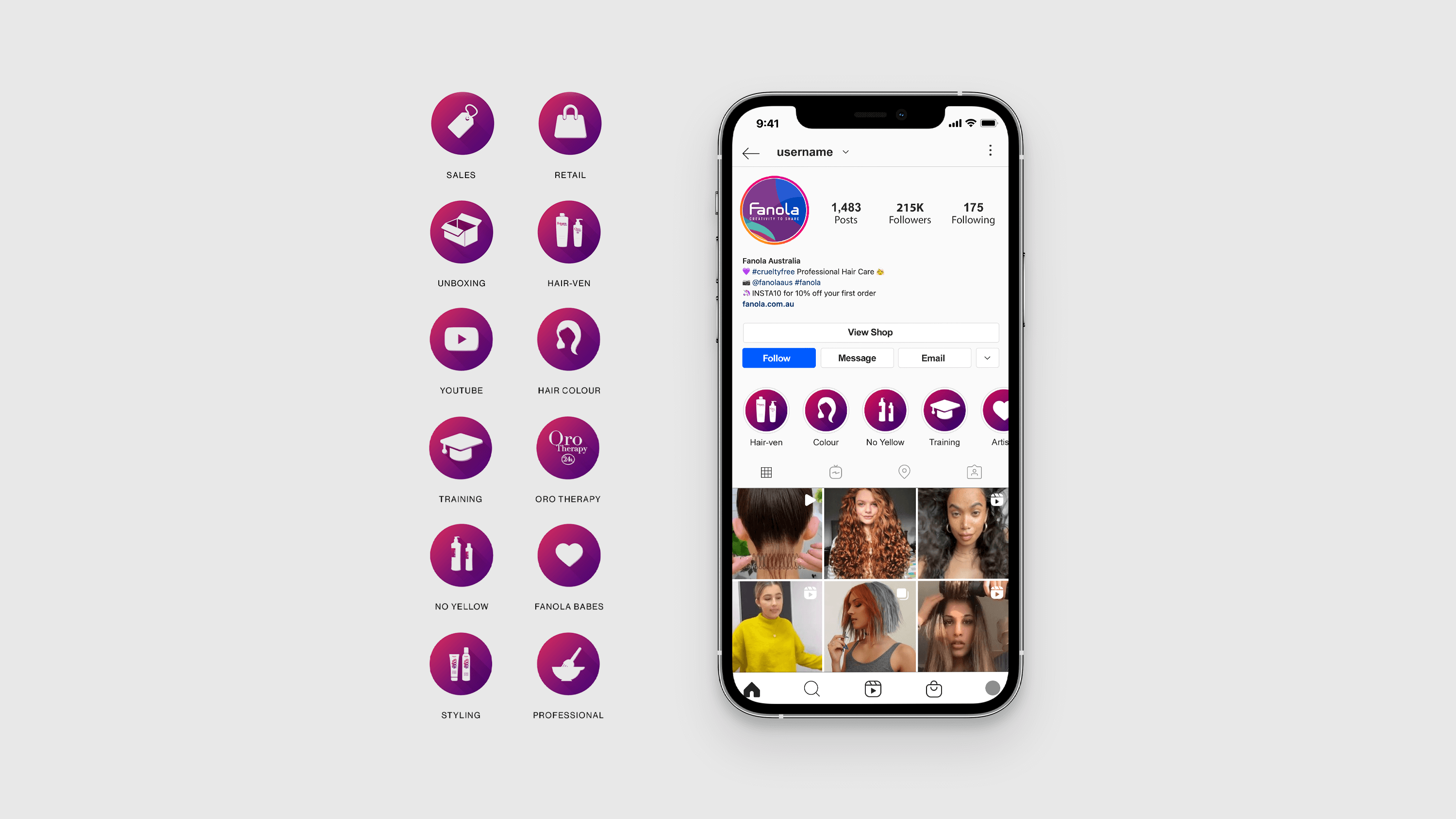

For this task, I was asked to design a series of Highlight Icons for Fanola’s Instagram page. The icons needed to be versatile, allowing for future additions with different shapes, while also being visually appealing and relevant to each category when viewed on small screens.
Using Illustrator, I developed a theme that could be adapted for additional icons later, ensuring consistency in style. For each icon, I designed visuals that clearly represented its category and optimised them for clarity and appeal on small devices.
The Highlight Icons were well-received, enhancing Fanola’s Instagram page’s visual appeal and providing flexibility for future updates.
Have a question for me? Send me a message and I will respond as soon as possible.